Hillary for America

Background

HFA tech team: 80 engineers, designers, and product managers
In the summer of 2016, I joined the tech team of the Hillary campaign as a designer and product manager. The tech team was organized around the ladder of engagement– one scrum team per key metric. But in the summer of 2016, our Chief Product Officer, Osi, noticed a gap. A large percentage of Hillary supporters on our email list were not donating or volunteering. To address this, Osi created a new team named "engagement." This is the team I joined. We were meant to be an experimental labs group with the prerogative of engaging "observers" in non-traditional manners. How do we nudge people up the ladder of engagement?

Ladder of engagement
Creating a roadmap
When I joined the engagement team, they had just launched a successful product that had gone viral. However, the team didn't know what to build next. Osi passed me a list of ideas, and a simple framework:
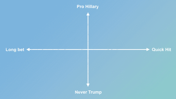
Make products for two audiences: Pro-Hillary fans and Never-Trumpians.
Launch a mix of quick hits and long bets.
With less than 100 days until election day, quick hits meant launching something in two weeks. Long bets got a month.
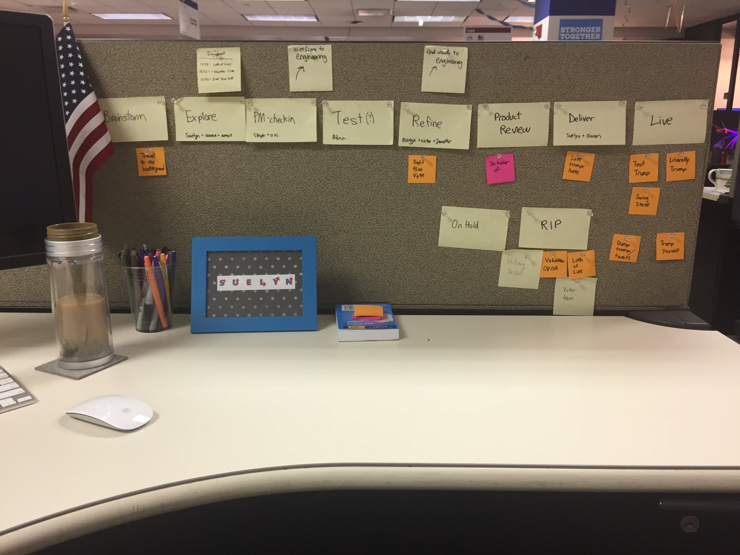
To build a roadmap, I challenged myself to make one prototype a day. Each morning I pulled an idea from the backlog, made a prototype with Sketch and Invision, and slacked a prototype to the team. Visualizing the ideas helped the us quickly test the desirability and viability of the ideas.
Most of the prototypes didn’t make it past product review, but about half of them launched. Here are the five projects I launched in my three months on the campaign. Because of the quantity of projects, I'll put more focus on the final designs rather than the design process.
Literally Trump debate fact-checker
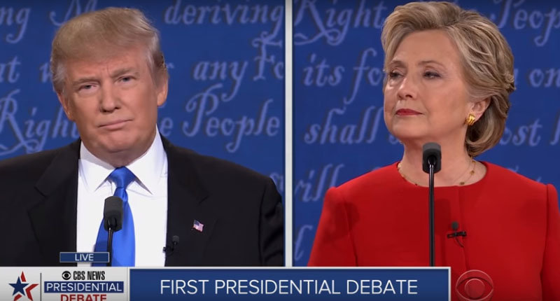
On the night of the first presidential debate, we launched a live debate fact checker. It was likely that Trump would lie during the debate, so we prepared a database of backup facts and quotes. Users could search facts, quotes, and videos, all backed up by a credible news source.
Hillary Clinton called out the website within the first 30 minutes of the debate after one of Trump's lies. In the debate war room, the rapid response team used a Django interface to update the front page in real-time. Users could react with emojis and share the content with pre-styled share images.
Interspersed between the cards were calls to action to solicit donations. If the user had saved their credit card, they could donate with one click.
After the night of the first debate we had:
2.1 mil visitors
20,231 Facebook shares and 8,722 tweets
27,036 searches
And a significant amount of donations

Video of live product

Mobile responsive design
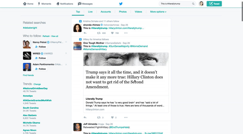
Twitter the night of the debate
Text Trump-bot
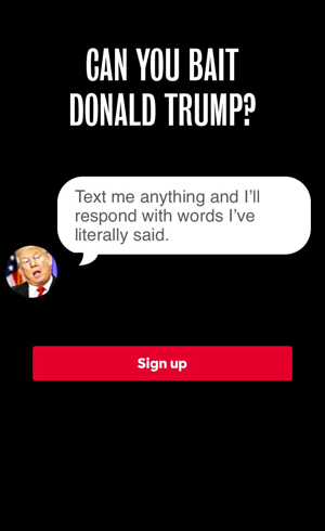
From Literally Trump, we learned that using Trump’s own words was one of the most potent ways to reveal his true character. But how do we get people to engage with this content? Our answer was: A Trump bot.
To nudge people to sign up for this tex bot, I designed a humorous sign-up flow that mimicked the experience they would get with the bot.

Sign-up page
The bot itself only responded with quotes Trump had actually said. At any point you could text SOURCE. If you texted something he couldn’t find a response to, we recommended new topics. When you insulted him, he responded with a real comeback he had used in real life. We wanted to mimics what felt like to be targeted by Trump, like so many female journalists had been.

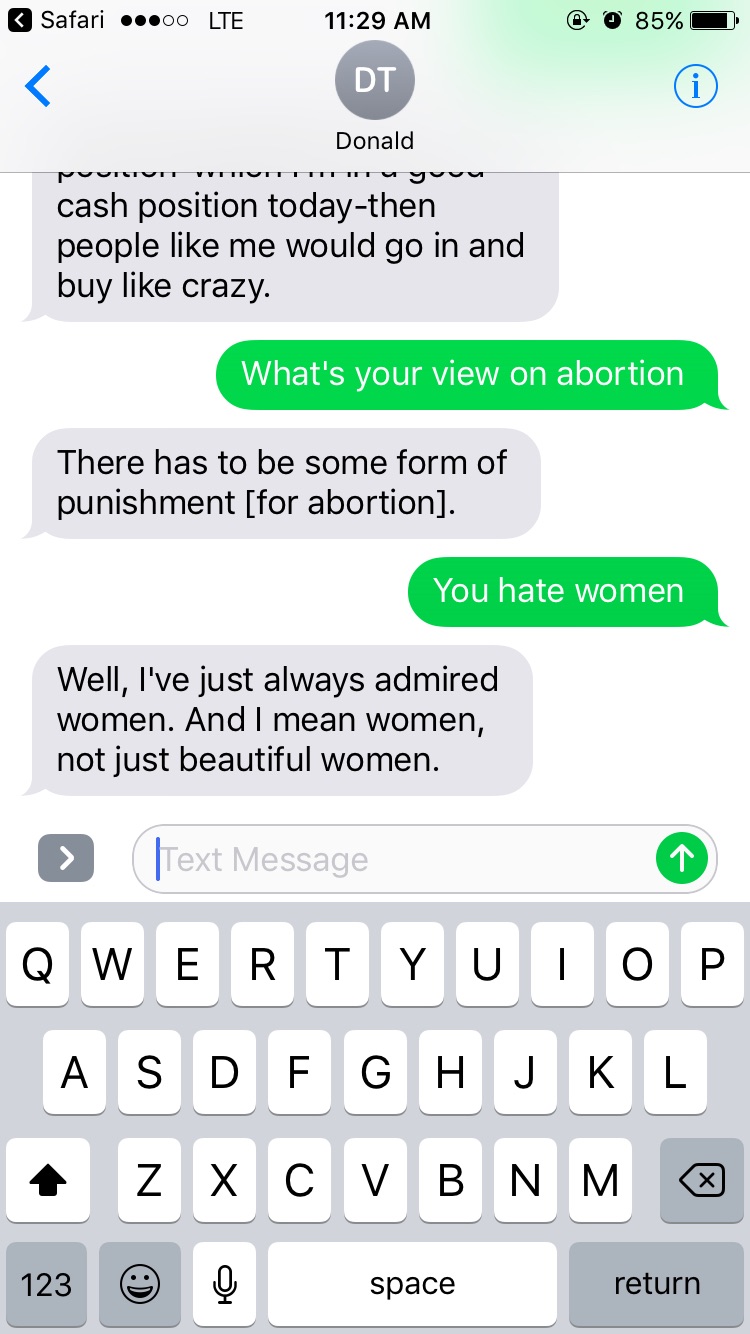
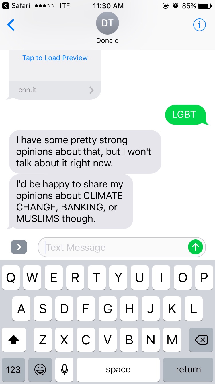
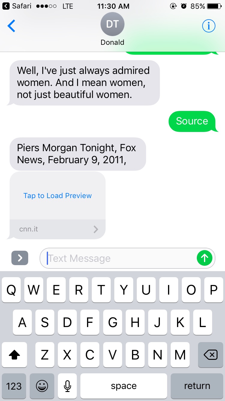
When we dogfooded the prototype internally, we learned that on average people texted back in forth 10 times. Our goal was to drive people up the ladder of engagement by either asking them to sign up for texts from Hillary or donations. This lead us to build in reengagement loops based on our prototype's engagement metrics. If you didn’t respond within 10 minutes, we’d text you again. After 4 back and forth's, we'd ask "Tired of Trump? Help Hillary beat him this November. Stop getting texts from Trump and text 12345 to get texts from Hillary." After 8 back and forth's, we'd asked "Keep Trump out of the White House by texting 12345 to donate to Hillary."
One of the most challenging parts of this project was designing while the opposition branding was evolving. During this project, Trump was actively trying to change his persona to act more presidential. Consequently, the Hillary campaign was adapting our response. We moved from poking fun at him and using a garish visual language, toward a more serious tone–focusing on his divisiveness and unpresidential temperament. You can literally see this change threw the visual and messaging changes in my landing screens:

First design

Second design

Third design
Final design
Swing a swing state chrome extension
After launching a few projects for the “Never Trump” audience, it was time to create something for the less engaged Pro-Hillary fans. Here are a few of the user insights that inspired this project:
Thousands of Hillary supporters wanted to volunteer, but didn't have the time or access to a field office. They wanted to know, “If I have 5 minutes, what can I do today?"
These same supporters knew the importance of swing states, but most of them didn't live in there. They were asking, "How can I affect a swing state?"
A lot of people wanted to volunteer, but lack the motivation to show up–a classic behavior change problem. How do we get in front of people every day to drive them to action?
Inspired by "new tab" chrome extensions, I created a prototype of "Swing a swing state" in a 1-day hackathon. After gaining internal momentum, we polished it up the next week to publish in the chrome store. We also created a website version for non-chrome users.
"Swing a swing state" highlighted one swing state a day until the election. Each time you opened a tab, it gave you one thing you can do. Users were able to mark actions as complete to track what they did that day. We also included a small delighter that explained why that swing state was important.


Love Trumps Hate
After the first debate, we saw our supporters flock to social media to express their love for Hillary. We wanted to capture this momentum and use it as an opportunity to further engage with them.
As most people know, this presidential election wasn’t a fight about issues. There was very little attention or debate about the candidates' actual policies. In the last few months of the election, we wanted to give our supporters a fun and lightweight way to express why they were supporting Hillary. At the end of the 3rd debate, we launched this "Love trumps hate" video generator based on the growing popularity of that motto.
Users could pick a Facebook photo, a "Love trumps hate" filter, and a quote representing an issue they cared about. Our app then generated a video, timed to a short soundtrack, that they could download or share directly on their Facebook timeline. At the end of the video, we directed people to iwillvote.com, a site where people could find how to vote on Election Day.

Desktop flow


In honor of
After Trump's Access Hollywood tapes came out, one of my friends on Facebook posted that he had donated in honor of his daughters. He asked others to do the same, starting a daisy chain of donations. People posted screenshots on Facebook of their donations. Inspired by this and similar nonprofit campaigns, I pitched "In honor of" as a collaboration campaign between the engagement and the donation teams.
Building on our existing 3-step donation flow, we built a new flow where users could donate to Hillary in honor or someone. Users could type in who they were donating in honor of, and create a custom card with their own facebook photo or a Hillary stock photo. After they donated, they were encouraged to post and ask five friends to do the same.

Lessons learned
During my time on the campaign, I learned a lot about design, politics, and my own motivations. Here are a few lessons for future campaign designers:
Design around moments
During the campaign, there are certain moments that people naturally tune into. Some you can plan for, like the convention, the debates, and voter registration deadlines. Others you couldn't, like news events and scandals. These moments draw the largest audiences. Our team's most successful projects, such as the Literally Trump fact checker, were the ones designed specifically around moments. Our promotion channels, email/social media/sms, were ready to push out these products. The projects that weren't tied to a specific moment had a hard time competing for promotion against other campaign priorities, such the omnipresent goal, soliciting donations.Everything is an MVP
When I joined the campaign, there was only about 100 days left. We didn't have time to test or debate every idea. I found the best way to validate ideas was building testable prototypes as quickly as possible. Since we were trying to change behavior, it was more efficient to test out five hypotheses with MVPs, than to build one full-featured solution.Strong opinions, loosely held.
This is a motto I've subscribed to for most of my design career, but I found it extremely important on the campaign. Campaigns are huge, fast moving organizations with a lot of people and a lot of opinions. If you had an idea, you can advocate for it. I was suprised by how many of my small ideas ended up launching a few weeks later. But most ideas got cut during the design process. Many of them even got to pixel perfect specs. There isn't any time to dwell on a bruised ego though. Everyone on the campaign understands that we're all working for a larger purpose, and for the machine to work, we need to trust the decision makers.Never stop believing that fighting for what's right is worth it. -H
There were some extremely tough days after the election. I was in disbelief, heartbroken, and in grief. And honestly, it took me months to recover. But I'll never regret working on the campaign. It was an amazing experience–despite the final outcome. I joined the campaign because I thought electing Hillary would be the most impactful thing I could do to combat climate change (and because I thought it would be pretty cool to elect the first woman president). Current events have definitely validated my original motivations, and I'm now even more motivated to find work to keep fighting the fight.
One of the most common questions I've asked is, would you join another campaign? For the right candidate, if it is the right time in my life, yes. Campaigns are grueling, but extremely rewarding, workplaces. I would encourage everyone to try one out as well.
About project
• Lead designer & product manager @ HFA
• July - November 2016
• 4 months
• Shipped and taken down after election
My Contributions
• Roadmap creation
• Lead UX/UI designer
• Creative direction
• Developer support
Engagement team
• Stephanie Chang, Product Manager
• Sarah Gray, Engineering Manager
• Danny Bowman, Front-end Engineer
• John Hergenroeder, Engineer
• Aaron Lewis, Designer
• Maggie Bignell, Designer
• Victor Ng, Designer